
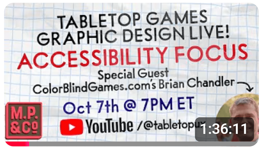
I met Matt Paquette in 2021 while playing and reviewing Mariposas (see Colorblind Games Review). I was impressed by the game’s subtle double-coding for accessibility, and designer Elizabeth Hargrave connected me with Matt, who shared elements of his design philosophy. We’ve stayed in touch since, and recently I joined him on the MP&CO. YouTube channel as a special guest to discuss game accessibility: Accessibility in Tabletop Games.
I shared the basics of my understanding of color vision in gaming from my perspective (see Colorblind Gaming 101 on this site and Board Game Geek). As part of our conversation, Matt brought several practical concepts from his graphic design background.
The Dark Pub Test
Similar to my recommendation to run every game component through a greyscale filter (with Matt also using it as an active part of his design review and workflow), he also considers readability by imagining the game being played in a dimly lit bar.
While it’s technically the same as “low contrast test,” the story-based scenario helps with the concept’s stickiness while introducing empathy through visualization. In turn, the story can help the design team form the habit of considering accessibility needs along the way.
Three-Criteria Card Text Framework
Matt proposed a simple rubric: sufficient contrast, readable text over art, on a solid background. Matt proposed evaluating card text legibility against these criteria, in order of importance:
- Contrast. Provide sufficient contrast between the foreground text and whatever is behind it (background color, illustration, or texture)
- Readability. Ensure text legibility when placed directly on top of an illustration
- Solid background. Sit text on a clean, uninterrupted color field rather than competing with imagery.
Often, a card or other game component that feels readable actually only passes one of these three criteria. That’s why they fall apart in dimly lit rooms (hence the “dark pub test”) or for people with low vision.
He provided a few case studies with examples.
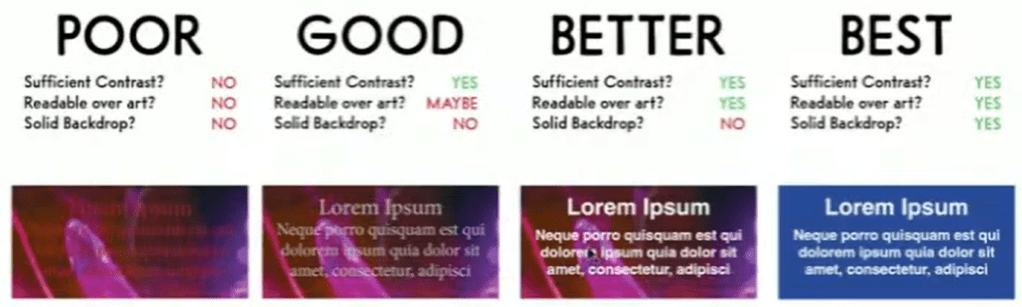
- Poor (fails all 3): Text directly over art, low contrast, no backdrop. It fails all three criteria.
- Good (passes 1 of 3): The contrast is technically sufficient with the available contrast tools, but the text still floats over the art with no solid ground. Passes one criterion.
- Better (passes 2 of 3): White text in a heavier, sans-serif face over art. Contrast is strong, it’s readable over the illustration, but there’s no solid backdrop. Passes two criteria.
- Best (passes 3 of 3): Text on a solid color field, strong contrast, clean typeface.
I applied this framework to assess a current and revised version of a card from Legendary: A Marvel Deck Building Game.
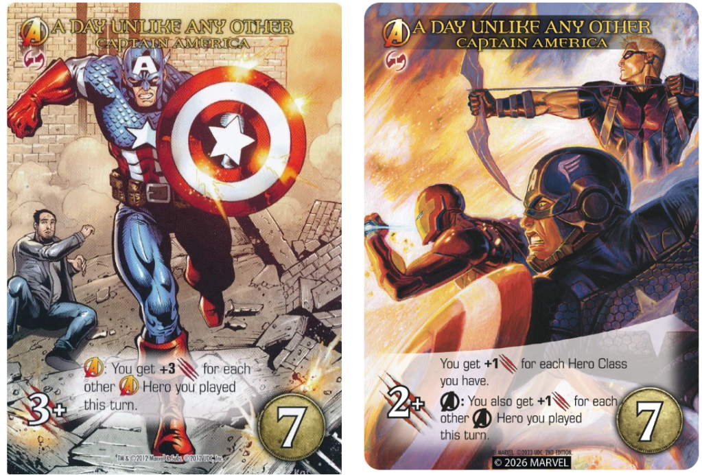
In the original base set (left, 2012), the card titles at the top fail all criteria, while the gameplay text at the bottom is in the “good” category (sufficient contrast and kind of readable over art). The second edition (right, 2026) improves contrast by adjusting the opacity of all text and backgrounds, putting the ‘slash’ graphic against a lighter background, and changing the “A” icons in the text to a simplified black version.
Typography
My day job as a traffic engineer includes visual user experience of highway signs, pavement markings, and traffic signals, including font size, style, and color (see Grey Means Go: Colorblindness in Transportation, ITE Journal, 2021). But I have not tackled font details in gaming, specifically. Matt, as a graphic design and user experience expert, dove deep into this area.
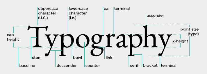
X-height. Referring to the ratio of a font’s lowercase letter to its capital letter (X and x are used for the measurement), a higher x-height is typically better for readability. It enlarges the counters (open spaces inside the letters) and makes lowercase letters easier to read simply because they are taller.
Counter size. These open spaces inside letters like “e” and “o” help readers denote the differences between letters, which is very important at small font sizes. For low-vision gamers and for anyone in low-light conditions, increased counters make a big difference.
Typeface width. While condensed fonts are not automatically bad (and their weaknesses can be mitigated with x-height, as described above), using a wider font when possible gives the eye more surface area to recognize. A “horizontal rhythm” of wide text is easier to track across the line of a card or other game component.
Tracking. Since tabletop game cards almost always include a fixed amount of text in a fixed (very small) space, adding just a little more space between letters can meaningfully improve readability at the same point size. This is especially helpful with ALL CAPS TEXT, since its “uniform band of rectangles” removes the variation in letterform silhouette of lowercase provided by the ascenders and descenders. Tracking partially compensates for this by adding some breathing room.
Serif and Italics. Serif fonts have finishing strokes at the ends of letterforms, and they provide transition – variation of stroke thickness within a single letter (like a capital “O” that’s thicker on the sides than the top and bottom). Grotesque sans-serif fonts lack serifs and transitions. Slab serif sits in between; it has blunt, rectangular serifs.
For readability of small fonts, transition becomes a problem because the “thin parts” approach the limits of a printer’s resolution or are too fine for people to see clearly; they are just too thin. Grotesque sans-serif solves that problem; without transition, every stroke is the same weight. Most problematic is italics, which are oblique versions of already-complex shapes. At small sizes, the added angularity compounds readability problems. Italics should never be used for anything mechanically important, but instead reserved for flavor text or other decorative content.
For More Information
I learned so much from my conversation with Matt, and even more as I watched the video and studied it for this summary. If this topic is of interest, I highly recommend following Matt Paquette and Company at www.mattpaquette.com and the company’s YouTube channel at MP&CO.
Special thanks to Matt for the opportunity to join his stream and then for allowing me to share my summary and responses from the conversation.
Watch the full version of our video on YouTube HERE.
Image Credits
- Top: Matt Paquette
- Dark Restaurant: KamranAydinov via freepik.com
- YouTube: Matt Paquette and Co (MP&CO.)
- Poor Good Better Best: Matt Paquette
- Legendary Marvel: Upper Deck
- Typography: Deepna KV, What is Typography in Graphic Design and Why it Matters
