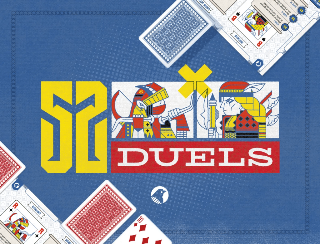
Welcome to 52 Duels, where 1-2 players use a 52-card deck to launch attacks, block damage, use items, and level up their hero’s unique skills. The deck also serves as each player’s life, so depleting all the opponent’s cards is the path to victory. Designed by Matthew Dunstan and Rory Muldoon, and published by Postmark Games, 52 Duels plays in about 20 minutes.
Format and Gameplay
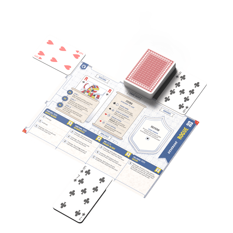
Like previous games from this publisher (see Colorblind Games reviews of Aquamarine and Scribbly Gum; other notables include Voyages and 52 Realms: Adventures), 52 Realms requires no special tools or components. A home printer and two decks of standard playing cards are all you need to enjoy this game.
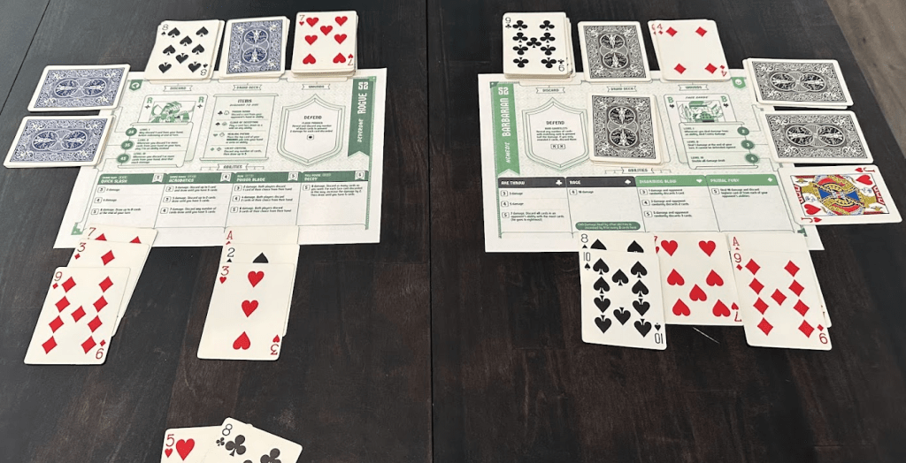
Actions each turn include placing multi-use cards in one of three main areas:
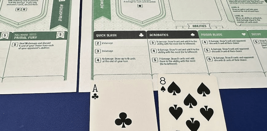
- Abilities. Attack the opponent by collecting multiple cards in the same suit, same rank, a run, or a full house. More cards on an ability increase the attack and special actions.
- Items. Discard a card to play a wild on an ability, affect the opponent’s abilities, or heal wounds.
- Level up. Depending on the hero, leveling up may increase attack damage, improve hand management, or provide other benefits.
Rory describes how balancing these actions is the key to the game:
“The character sheets are the secret sauce that allow us to create this tense head to head experience. You can queue up big attacks by playing runs and sets, or you can level up and leverage your character’s unique play style. Your deck is also your health so there’s this constant tension as to how you use your hand of cards each turn.”
Visual Accessibility
Postmark Games has a long history of excellent accessibility features, primarily through the low-ink greyscale versions of each primary game board. While this preview of 52 Realms did not provide the low-ink player sheets, I printed mine in black-and-white at home and was able to play without issues.
Color Vision
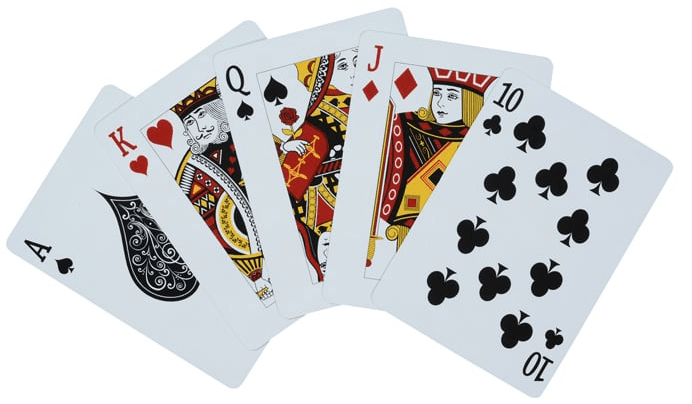
With four suits and double-coding (colors and icons), along with vertical symmetry, poker cards are a classic colorblind-friendly game component.
The graphic design on 52 Realms’ player sheets is equally accessible, with no color-specific information in the game. Everything is double-coded, allowing for a full greyscale play. This is the true definition of colorblind-friendly!
The draft rulebook mostly follows suit, with one exception shown below. The discussion of ability bonuses (currently available on the Barbarian hero abilities) references “blue boxes.”
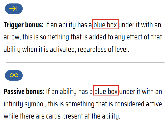
Since these descriptions are supplemented with icons, I was still able to determine the meaning without relying on color. To improve this section for colorblind players, I recommend describing the Trigger bonus as follows: “If an ability has a box under it with a right-pointing arrow and vertical line…”, and I suggest a similar removal of “blue” for the Passive bonus. This will remove any ambiguity for gamers with color vision limitations and for those who print player sheets and/or the rulebook in black-and-white.
(Update: I provided this feedback to Matthew via email a few days ago, and he responded immediately that they plan to update the rules accordingly. It might already be fixed in the next version you see.)
Low Vision
With a print-at-home game, font sizes must be large enough to be legible when printed on lower-end home printers. On typical US letter-size paper, I found all icons, numbers, and text easy to read.
Conclusion
52 Realms is a worthy addition to the Postmark Games series, and I’m excited to purchase the full version to see the two additional heroes (which will be added during or at the end of the campaign) and all future content!
The Kickstarter campaign for 52 Realms is scheduled to run December 2-14, 2025. If you’re reading this after the campaign, see the Postmark Games website to purchase.
Images and graphics by Postmark Games. Gameplay photos by Brian Chandler.
Colorblind Games received complimentary access to game files for 52 Realms for this preview.

The Rogue’s Defend cost mentions the “black cards” and the icon is a red circle. Like the issue you mentioned with “blue”, would that be better as the icons of the two suits with a slash between them?
LikeLike
Good catch – Yes, that would be another good fix to keep the “color-only language” out of the rulebook.
LikeLike