

Perennial, designed by Emily Vincent and published by Flatout Games, is a tile-laying puzzle game set in a prairie garden. I love polyomino games, and Perennial scratches that itch in a new way. The twist drives gameplay: after drafting tiles in the shape printed on tool cards, players reassemble those and other tiles into a shape dictated by their collection of “tools.”

Not surprisingly, given the Flatout Games development team, Perennial included hints of Fantastic Factories, Tiny Towns, and the Sprawlopolis series, along with other Flatout Games titles. The full game (with optional goals) is the heaviest Flatout game I’ve played, and that extra crunchiness earns it a place on my shelf among other tile layers.
For those seeking lightweight gaming, Perennial’s Family Mode takes care of that. It removes some components and simplifies the experience for younger players or anyone seeking a lighter experience.
Accessibility
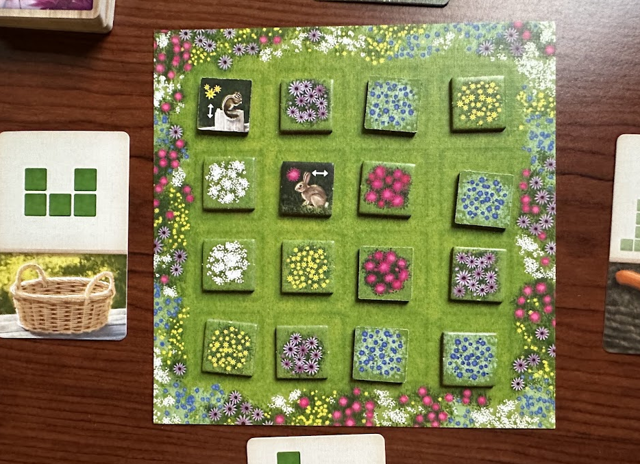
Perennial is a beautiful game with Beth Sobel art, evoking the natural world of flowers and animals while maintaining accessibility for players with low vision and/or color vision deficiency. The flowers, in particular, look great and are easy for me to distinguish, and I liked that their natural shapes provided double coding without additional symbology.
Tiles and Flowers and Symbols
The five flower types look great and are easy to distinguish, with or without color. Other symbols on animal tiles and game boards are quite good, too; each evokes both the color and shape of the relevant flower.
Perennial also fixed my single quality-of-life complaint about Cascadia’s animal tokens by printing the same information on BOTH SIDES of each tile! Hip hip hooray!

Boards and Cards
Player Garden Boards. The garden boards are generally solid with clear iconography for placing the greenhouse and seeds. But when I played my first game, I couldn’t find the boulder spaces, The icons identifying boulders are small, blending into the background and looking similar to the other art elements.

Player Workshop Boards. The individual player boards are generally clear, but I have two small gripes for low-vision players. In each case, the rulebook clearly describes the relevant information, so this is more of a quality-of-life preference than a need.
The player aid font at the top of the board is very small and in ALL CAPS, making it challenging for me to read without extra squinting or brighter lights. I can see the challenge of fitting everything on this board, so my solution would be to add another half inch and use uppercase/lowercase to improve readability.

The second is a contrast issue at the player aid info on the bottom, where 3 TILES MAX AT ROUND END is light font on a light/medium background; darkening the background is an easy fix to make that easier to read, and I’d request uppercase/lowercase again to support low-vision gamers.
Score Sheets

In less-than-ideal lighting conditions, I couldn’t immediately distinguish the score sheet’s flower colors from one another. I reverted to zooming in with my phone to be sure.
Conclusion
The team behind Perennial did an excellent job creating a game with colorblind gamers in mind. Low-vision players may have minor issues, but with no secret information, asking for help with a detail will not thwart your strategic advantage.
Perennial is currently on Kickstarter. You can visit the campaign here and Flatout Games at flatout.games.

Disclaimers and Credits:
- Colorblind Games received a pre-release copy from the publisher for this review.
- Brian has served as a volunteer playtester and rules editor for several Flatout Games titles.
- Image Credits: Box art and last image: Flatout Games. All others: Brian Chandler.
